 Are you getting the results you want from your website? If you are not using a landing page or pages on your website then you most definitely are not.
When a visitor finds a regular page on your website like your home page, a blog post or your about page they will be presented with menus, widgets, suggested posts and all sorts of other distractions that are great for a casual visitor to see to get to know you and your business better.
Yet when purposefully driving traffic to your site through ads or even social media posts you ideally want them to follow a specific outcome such as an opt-in to build your email list. To do this you need to make sure that the page they are sent to is highly optimised to do one thing… to get your website visitors to take the next step with you.
That’s where a landing page, squeeze page or opt-in page come in (all terms used meaning the same type of page).
What is a Landing Page?
A landing page is the web page people land on when coming to your website. However, when used in marketing it refers to a page that prompts one desired outcome or result…to capture someone’s details so you can keep contact by email and build a relationship with them through a follow up funnel. That means everything about your landing page needs to be geared towards politely nudging people into taking that desired action.
Why should I use a Landing Page?
The fact is that email marketing is still one of the most effective forms of marketing and is generating billions of dollars of revenue worldwide. According to Amy Power in an article for Business 2 Community, up to 42 percent of e-mails opened are on a smartphone. Perhaps this is because the push notifications compel us to open our emails more often on our mobile devices. If you want your slice of the pie, once you have set up your email marketing software, you need to look at how you are getting people onto your list – having a landing page to direct people to makes their decision easier by limiting distractions and prompting their sign-up.
If you need to see numbers to be convinced, here are a couple of stats you should know about:
Click here to tweet >> 64% of marketers say landing pages are the most effective test of value proposition (Ion Interactive)
Click here to tweet >> Only about 22% of businesses are satisfied with their conversion rates (Ion Interactive)
In short, you should use landing pages if you want to improve your chances of a satisfactory conversion rate.
Before we give you some landing page creator recommendations, we want to first help you to understand how to create a landing page.
Here are 10 things you should keep in mind when creating landing pages:
1. Decide on your ideal client.
You’ve probably heard people talk of picturing your ideal customer as an avatar – what are their needs, interests or wants? What keeps them up at night? This is a useful exercise to keep in mind when you are creating an opt-in page as all elements of the page should be geared to attract that ideal customer including the language you use, the look of the graphics and the choice of testimonials you include on the page.
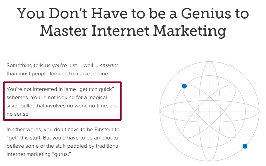
Below is the top portion of an opt in page from Copyblogger. As you can see, it is written like a sales page and it also excludes certain people from subscribing (anyone looking for a “get rich quick” scheme). Both including text around who is excluded from your offer as well as specifically who it is for, is important for ensuring that your list is as targeted and compatible with your business as possible.
2. Use a good landing page design.
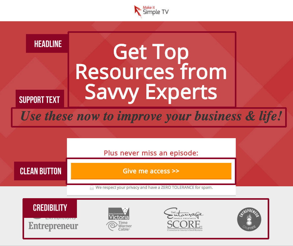
… and when we say ‘good’ design, we mean one which meets the following criteria:
- Has no extra navigation or menu on the page which tempts people to click away. Certain ad accounts like Google AdWords will require you have navigation but do your best to keep it at a minimum.
- Includes a headline of what your visitor will get should they choose to take the next step with you.
- Has an area for either a sub-headline or additional text to explain or bullet what the free item you are giving away will include or how it will help the person once they opt-in. This is the area you could also include a video.
- A clean button that contrasts the rest of the page so it is obvious.
- Credibility points such as awards, partner logos, “as seen in” or testimonials
Here is a great resource for your color schemes. We love using Canva and they have written a fantastic piece about Website color schemes. As Buffer writes, over 90% of our assessment of a product is made on color alone, so it makes sense that color should be considered with care for every design decision, particularly on websites. Chances are, if we don’t like the color palette, we’re not going to stay on the site for very long.
3. Only include what someone needs to say yes.
That old saying “a confused mind never buys” works the same way for opt-in pages! As mentioned, there should be one clear goal for your landing page (to get people to sign up with you), and that should be very clear to the viewer of the page.
When you review your opt-in page, every element of it should support that end goal of getting people to sign up – get rid of it if it doesn’t!
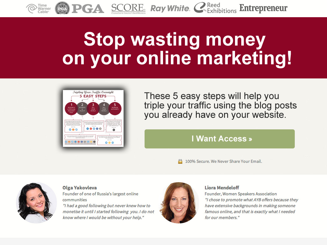
You should also avoid too much clutter on the page and make sure that when people first land on your page, it supports what they thought they were clicking on. For example, if we were running an ad saying “5 Ways to Save Money on Your Online Marketing”, we would make sure that the page people click through to immediately meets that expectation.
For an example of a very simple opt-in page that clearly outlines expectations, below is an example of one of our Quick Tip Downloads. You can also check out the page here.
4. Write an attention-grabbing headline.
This is a key element for an opt-in page. It is what’s going to catch the eye of your ideal subscriber and either make them leave your page or decide to stay and consider accepting your offer. Of course it’s not always easy to figure out but you could try split-testing different versions to see what converts better.
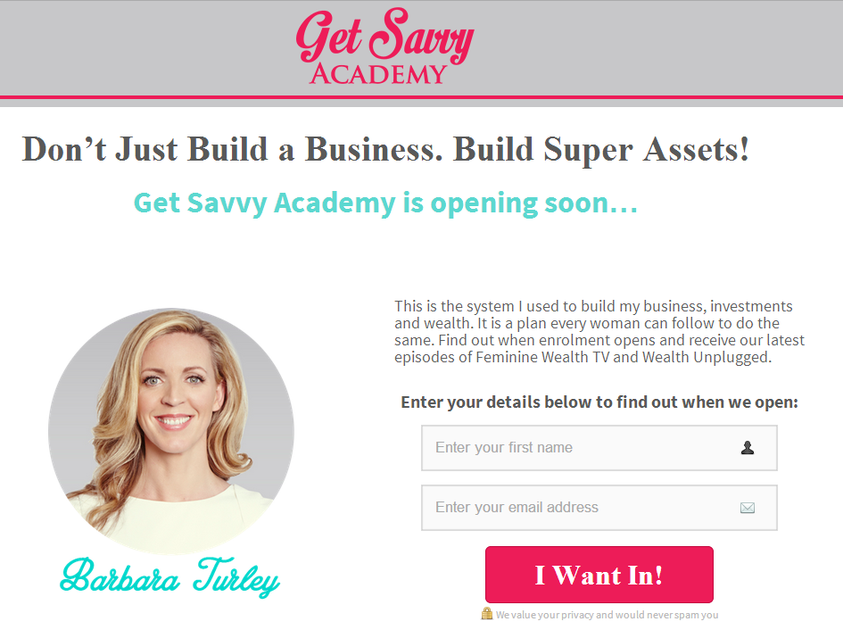
As illustrated below in one of the “Coming soon” landing pages we built a good headline is short, to the point and located towards the top of your landing page.
This article from Unbounce shares some great comparisons of what happened when they tested different types of headlines. You may also want to check out our article about how to write a headline or how to write copy for your sales funnel.
5. Make your page answer “What’s In It For Me?”
An essential part of every landing page is to very clearly include the benefits to the subscriber. Why should they sign up with you and what will they get? A key thing to remember is that a benefit answers that question, “what’s in it for me?”.
You are not meant to list features but instead share how specifically what you are giving away will help the person. Sometimes it can get confusing about what a feature is versus a benefit, so for example a “free coaching session” might be a feature of a package, but “gain clarity on your goals” would be a benefit of that feature.
Keep your benefits clear and to-the-point, allowing the reader to quickly understand what they will get. Bullet points are a good idea, as well as using bold text for points you really want to stand out to assist with those who prefer to skim through what they see online (which lately seems to be most of us).
6. Make your opt-in form nicely designed and “to the point”.
Opt-in forms should look appealing. That means taking the opt-in code you get from Mailchimp, Aweber or your other email marketing software customised so it graphically looks good and matches the look of your page.
Ask for as little information as possible if you want people to sign up with you. Why? People are often reluctant to part with too much information and it is human nature to often look for the quick route, which means too many fields to fill out can be off-putting. Keep it to bare minimum, such as first name and email address or just an email address if you are giving away something they can consume digitally.
The header area of your opt-in form should also match the messages that go with the rest of the page. Oli Gardner for Unbounce points out: “you need to introduce the purpose of your form before you ask people to fill it out. Your form should be able to stand alone on the page.“
Button colour and text is another consideration for your opt-in form. Ideally you should test different combinations to see what works best for you, but using a call to action such as “Get Instant Access” tends to work better than plain old “Submit”. Buttons with ownership have proved to convert better as well such as “I Want Access”.
Contrasting button colours that stand out on the page also tend to do better, although you will see conflicting studies over which colour in particular works the best. Hybrid Connect provide some excellent suggestions here for improvements on some case-study opt-in forms.
It comes back to testing for yourself, but check out this infographic from Quicksprout for more ideas:

7. Make your call to action say exactly what to do next.
We alluded to this in the last section about the button, but it’s important enough to warrant its own point. You may think it is obvious what you want people to do, but you will find a better response if you actually spell it out to them.
An example of this would be to write the words above your opt-in form “Fill in your details below to get your free report” or “Click the button below to get access to the training”.
Here are few more tips to keep in mind when crafting your CTA:
- Eye-catching colors: You need a color that contrasts with the design of the rest of your page. Here is a great little color picker tool. You can enter the hex code of your main brand color in the bottom left box and then in the top area you have buttons you can click on to see different color palettes using your main color. This way you can get an idea of a color that contrasts yet still looks good with your general design.
- Words that make people want to act: Stay away from heavy jargon, tell someone exactly what they will get (i.e. a free download) and how they get it.
- A clear value proposition: Make sure to clearly explain what will happen next and what someone gets once they click on your button. We have known business owners who have run into trouble being misleading by displaying a graphic of a DVD, but the person got a downloadable video instead of the actual DVD.
8. Include social sharing buttons.
If you take time crafting your offer then hopefully people will want to share it with their friends on their social media accounts. You can’t ask for better free marketing so ensure you make it easy for them by including those social share buttons!
Most landing page software platforms include this for you so you can add in the most popular share buttons such as Twitter, Facebook, Google+, LinkedIn and Pinterest. Here is an example of what some might look like.

9. Show social proof.
This one isn’t always used, but it’s definitely great to have if you can get it! People like to see social proof that what they’re signing up for is popular with other people. You can do this in a few ways:
- Testimonials: Whenever you can get testimonials that are specific for each item you are giving away on each landing page do it. If you are just starting out you can use more general testimonials from people who have gotten results from your business as a whole. Here is an example of how a block of testimonials could look to save space. This is from our websites home page.

- Social Media Shares: You can also enable a share count on most social share buttons too so if you have a lot of shares this is a great thing to show on your page.
- Third Party Endorsements: This could be stats or studies highlighting a problem and how what you are offering is a solution.
10. Use your thank you page as a chance for them to take another step.
By far the thank you page is one of the most under-utilised pages. It is where someone is sent after they enter their details in the opt-in form.
If someone has just signed up with you, they are much more likely to take another step with you right after that moment. Make your thank you page count by adding other things the person can do with you such as set up a call, visit your blog or read some other related content that may be useful.
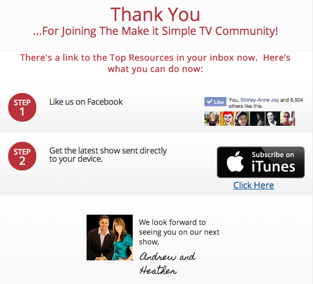
Below is part of a thank you page we use when someone signs up to get updates for our MakeitSimple.tv show.
As you can see we are now asking for people to connect with us on Facebook with a “like” button that can be clicked directly from the page and also to subscribe to the podcast version on iTunes. At that point those are 2 excellent next steps for someone who is interested in what we are offering to stay connected with us.
What is the difference between a landing page and a sales page?
A sales page is technically a landing page because you would be sending traffic directly to that page and they will “land” on it. In this article we refer to landing pages as opt-in pages which is how most people refer to them.
However you can also create a page to sell something such as an info product, product bundle, membership site or anything else you can think of. A sales page also of course has just one goal and limits text and navigation in order to point to that goal… to make a sale. Your sales page will generally contain more points explaining why people should buy from you and more factors to convince them such as videos and testimonials.
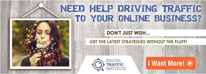
For example, here is our sales page for Digital Traffic Institute, where you can see we give lengthier explanations as to what people will get and the benefits of signing up. People will generally not need as much convincing on a simple opt-in landing page where they are not being asked to buy anything!
Are There Tools To Create Landing Pages?
Yes! There are a number of tools available out there which make it pretty easy to create a landing page without having to call your web developer. Just use an already-tested landing page template and add in your own details.
Here are a couple we love:
- LeadPages – Includes templates of tried and tested landing pages which you can easily customize to your requirements. You can use the WordPress plugin to display these pages on your own domain or get LeadPages to host your page for you.
- Optimize Press – You can use the plugin with your WordPress website to create landing pages as well as other types of pages like sales pages, launch funnels and membership sites. This one is slightly more complex to use but has more customizable features.
- ClickFunnels – This is a newer tool we have yet to use but you can build a full sales funnel from opt-in page to sales page and more.
- instapage – Here is another one we have heard good things about but have not yet used ourselves.
Make sure your website (and landing pages) are mobile friendly! Get some easy tips here…
What is a landing page? In short it is the type of page you need to be using if you want to attract more sign-ups from your website. The important thing is to try and test them, tweak different elements and see what gets you the best results.
